
A webinar is a visual tool.
Many marketers and webinar hosts forget this important fact — and their webinars suffer.
Yes, your webinar’s content has to be relevant, engaging, and valuable. Yes, you have to drive the right attendees for your topic. And yes, audio quality is important too.
But even if you’ve nailed these other aspects, if your onscreen visuals are flat and boring you’ll end up with one of these types of webinars that attendees dread (and quickly abandon):
- Text-heavy slides with bullet after sub-bullet: Putting nothing but text onscreen during your webinar is a huge missed opportunity to engage attendees, who are already listening and don’t want to read a transcription at the same time.
- A forgettable text + clipart presentation: This strategy shows slightly more creativity, but it’s not going to inspire your audience or position you as any kind of thought-leader.
- An unwanted demo: Unless your webinar is designed to be a product demo, and you’ve advertised it as such, people are going to lose interest viewing screen after screen of your product. Bor-ing!
One of the best things about a webinar is that it can be a multimedia, immersive and interactive experience. Don’t blow the opportunity to really connect with your audience with dull visuals that don’t serve a purpose.
Here are 3 ideas for highly engaging webinar visuals:
1. Use eye-popping, provocative images
Marketers building webinar presentation often make two types of mistakes.
Some create a slide using the text-plus-image formula thinking it makes their webinar more visually interesting. But they’re wrong.
Don’t create webinar slides that look like this:
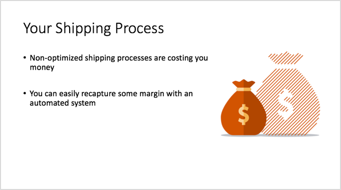
As you can see, this slide looks suspiciously like a typical text-heavy slide, and eventually, attendees will tire of this convention and tune out.
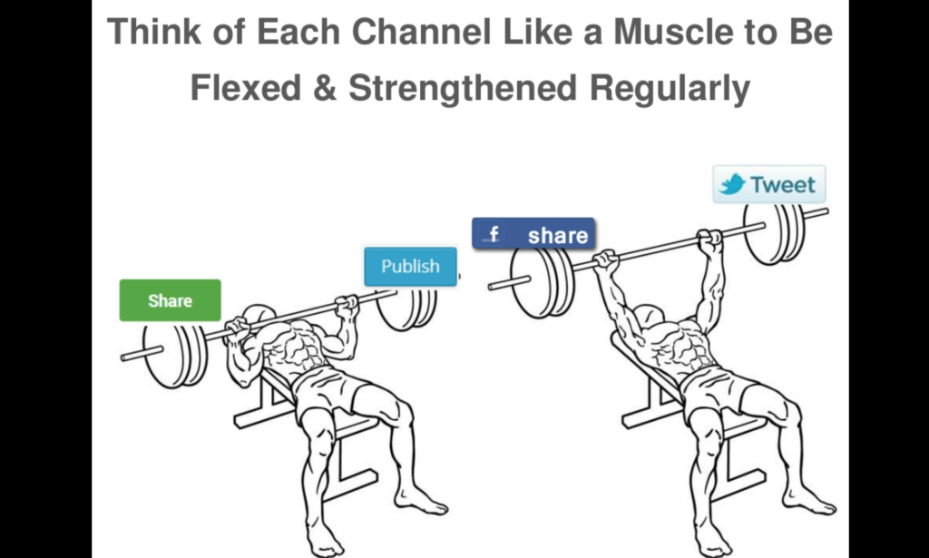
Other marketers make the mistake of finding a theme for their visuals — say, attractive young people looking at mobile devices and smiling — and they use similar images for every slide in the webinar. These might look something like this:

But generic slides like these are boring and forgettable. They don’t add to the story.
Instead, find visually interesting imagery for as many slides as you can. Use eye-popping photos, GIFs, and even screenshots to tell your story and add insight or fun to your message. Your visuals should help you tell your story in a way words alone can’t. If you’re presenting data, use charts and other forms of data visualization that help bring the information to life.
Here’s a slide I like from Rand Fishkin’s Why Content Marketing Fails presentation. It’s not fancy by any means, but it’s memorable and gets a point across.
2. Include a video right in your webinar
Admit it: When you come across a video clip in your LinkedIn feed, you click on it, right? Who doesn’t love movies?
Well, with the right webinar platform, you can seamlessly introduce a video clip during your webinar.
Maybe your company has a powerful customer testimonial video, or you’ve got a great explainer video. As long as it’s relevant to your subject matter — and as long as it’s interesting — your video will add visual interest and impact to your webinar.
3. Add an interesting background to your webcam view
Another powerful visual tool you should use in your webinars is your own smiling face.
According to research reported in Forbes, eye contact gives us a deep feeling of connection to the other person. This holds true even if that eye contact isn’t “real,” meaning the other person isn’t actually looking back at us. In fact, researchers found people feel this same connection even when looking into the eyes of drawn or photographed eyes.
So although it’s true that if you host a webinar with hundreds of attendees, you won’t be able to see each of them directly, their ability to see you will give them a stronger sense of connection to you during your webinar.
But too often, hosts start their webinar, flip on their computer’s webcam and start talking — without thinking about what’s in their camera’s background. A bustling office behind you could be distracting. Halloween decorations adorning your cubicle probably won’t play so well in future viewings of your webinar recording. And watching a webinar host talking in front of a blank wall can be, well, boring.
Make sure your background is professional but also has some visual interest. If you really want to go a step above and beyond, you can use a green screen tool, which lets you replace your background with any image you want.
You can go from this…

to this…
 Remember, you don’t ask your attendees to read or listen to your upcoming webinar. You ask them to watch it. At the end of the day, a webinar is one of the most valuable interactions you can have with your prospects. It’s worth investing in visuals that are memorable and compelling.
If you want to learn more about creating engaging, interactive webinars, watch our on-demand webinar, Riotous Fun: 9 Insider Facts for Highly Engaging Webinars!