
Let’s start with a question:
Would you try to code an app, make entire a sushi dinner or fix a car with no idea of what you’re doing?
The obvious answer is no.
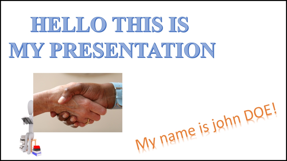
And yet, when it comes to designing presentation slides, we think we can improvise and wing it. But we end up with hideous slides that look something like this:
A slide presentation is a visual communication tool that illustrates your message – and your message deserves better. The good news is, learning to effectively design slides to maximize the value of your presentation is much easier than fixing a car.
I’m going to go over three super easy-to-implement strategies that will help you create epic slides. I use these strategies all the time, and the difference they’ll make to your slides is the difference between night and day.
1. Don’t design a single slide until you’ve outlined your presentation.
Many of us are eager to jump right into the slide creation process. The problem is we end up winging the entire presentation, desperately hoping that at some point it’s all going to come together (spoiler alert: it won’t).
End the madness. Before you open PowerPoint, Prezi, Canva or whatever tool you’re using, grab a pen and paper and structure your content.
- Outline key points
- Order them in a narrative structure
- Add design ideas, dramatic effects, colors and anything else that will bring your story to life
To give you an idea of what I mean, here’s something I did in the past (please ignore the awful handwriting):
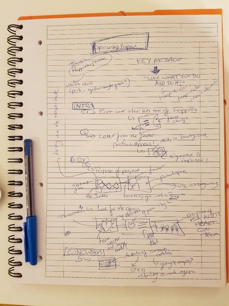
The beauty of this strategy is understanding the key purpose your slides serve. Your slides are nothing more than tools that enhance your message. Don’t fall into the trap of believing your slides are your message. They’re not. Plain and simple.
When you’re done with your outline, start designing your slides and you’ll notice how everything you create relates back to the ideas you plotted and boundaries you outlined. You’ll begin producing better results just because you have a blueprint in place that ties everything together.
2. Be consistent, but not too consistent.
A well-designed slide deck means that each slide is part of the same story. To create a cohesive story, use consistent design components: colors, images, shapes, typography, etc.
But there’s a caveat.
Too much consistency restricts creativity and leads to dull slides.
Don’t be afraid to bend the rules of consistency. Each slide shouldn’t look exactly the same. Instead, look for ways to transform your message without drifting too far away from the structure you’ve created.
Let’s look at a couple of examples.
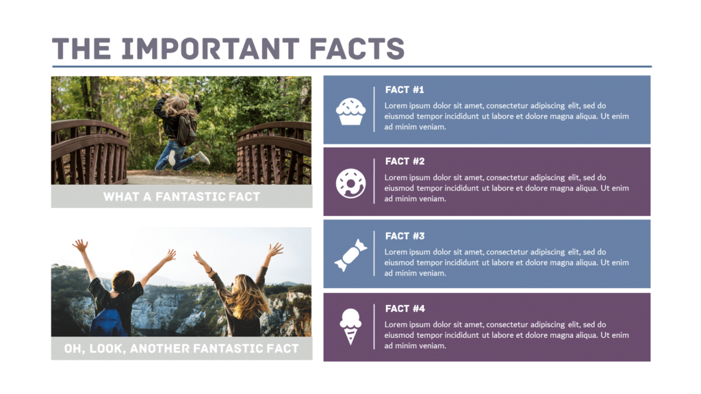
Here’s the first slide. Nothing fancy, just a few points listed.
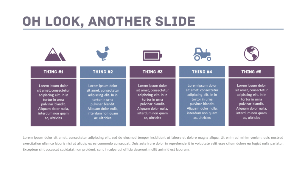
Here’s the second slide. A little different but similar.
Here’s the third slide. Very different, but it doesn’t lose touch with the previous two slides.

Notice how each slide has a different layout and design while maintaining the same look and feel through consistent fonts and colors.
Don’t be afraid to bend the rules and add a touch of creative flair to your message. Just don’t go too crazy! Make sure that your overall design style ties everything together.
3. Use color to bring out your key message.
Now that the time-consuming stuff is out of the way, it’s time to talk about something that you can implement immediately. Let’s talk colors.
I play with color palettes a lot, and so should you. Color not only influences how your audience thinks, but you can use it to emphasize a point, add meaning, create a mood and more.
One application you can easily do (right now) is to use colors to create contrast and highlight key parts of your message.
Look at the slide below:
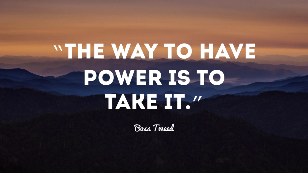
And look at it now:
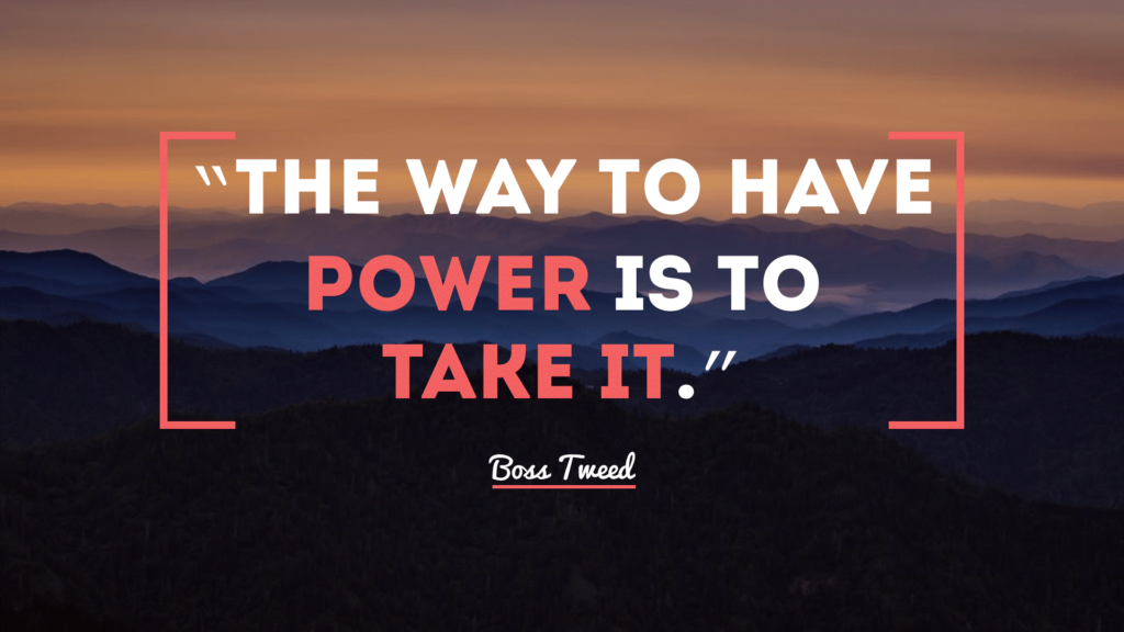
All I did was change the color of a few words and add a few shapes to bring out the message.
If you’re feeling really creative and want to see different color options that you can use for your presentation, check out my take on using the Color Supply.
Get to work!
These three tactics will help bring your slides to the next level. But remember, effective presentation design isn’t a cakewalk. The best way to be good at something is to practice. There are no shortcuts.
But with the right mindset, you’ll be an epic presenter in no time.
To learn more about mastering slide design, watch the on-demand webinar, PowerPoint Design Tips to Really Make Your Slides POP!